
DE-MSHORAD - Northrop Grumman
Adapting a Complex Desktop Interface for Field Tablet Deployment
Due to the competitive and proprietary nature of this work, screens and design artifacts cannot be shown. What I can share is the problem space, my process, and what drove my decisions. I'm happy to go deeper on any of it.
The Short Version
A complex, information-dense desktop C2 interface. Adapted for tablet deployment in field conditions — outdoor light, gloved hands, operators under stress. Every decision about information density affected touch usability. Every layout change affected how much operators could see at once.
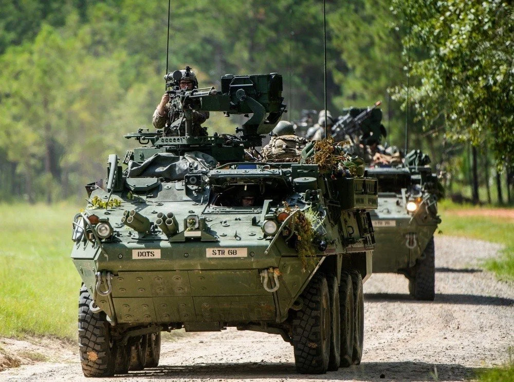
Stryker combat vehicles at Fort Benning, Ga., September 2020, during training for the DE-MSHORAD program — the directed energy air defense system I designed operator interfaces for as part of Northrop Grumman's competing effort. Photo: U.S. Army photo by Patrick A. Albright (publicly released)
The Problem
As part of Northrop Grumman's bid for the U.S. Army's Directed Energy Maneuver Short Range Air Defense (DE-MSHORAD) program, the challenge was straightforward to describe and genuinely hard to solve: take a complex, information-dense desktop C2 interface — built for mouse, keyboard, and a full monitor — and make it work on a tablet, in the hands of operators working outdoors, under stress, potentially wearing gloves.
Neither constraint could be solved independently. Every decision about information density affected touch usability. Every touch-friendly layout change affected how much operators could see at once. And the physical environment added a third layer: bright outdoor light and gloved hands aren't conditions a typical product designer designs for, but they were non-negotiable here.
My Role & Process
I was one of two UX designers on this effort, working across internal R&D prototyping and proposal support — designing a credible, operator-ready solution to demonstrate Northrop's capability to the Army. I owned interaction design and layout restructuring for the tablet adaptation.
Northrop was not awarded the contract, which is a normal outcome in competitive defense procurement.
I had limited but meaningful access to operators during this project — enough to understand their workflows and where the existing interface created the most friction. I used that input to prioritize: which elements were most critical during active operations, and which were secondary tasks that could be deprioritized or restructured without affecting operational readiness. That prioritization became the foundation for how I restructured the layout hierarchy for smaller screens.
From there the work was iterative — balancing touch target sizing, information density, and visual hierarchy against the technical constraints of the platform. The field-condition constraints pushed decisions I wouldn't have made otherwise: higher contrast thresholds, larger touch targets than standard guidelines recommend, and layout choices that assumed the operator might not be looking directly at the screen when they reached for it.
What I Learned
This project sharpened my ability to make difficult tradeoffs between competing priorities — information completeness versus interaction simplicity — with limited user access and inside a requirements-driven environment. It also made permanent something I'd understood abstractly before: physical context isn't a constraint you accommodate at the end. It shapes every decision from the first layout sketch forward.