
Precision Garage Door - Homepage Redesign
MOOD Technology Consultancy | UX/UI Designer | 2025
The Short Version
Precision Garage Door's brand had fragmented across multiple regional sites. I designed a unified homepage system — wireframes, style guide, and responsive mockups — that shipped to production.
The Problem & My Role
Precision Garage Door operates across multiple regional markets, each with its own website. The real problem wasn't just aesthetics — the brand had drifted into inconsistent visual directions across those sites and needed a unified system to anchor it.
Contracted through MOOD, I designed a modernized homepage to serve as that foundation — delivering wireframes, a visual style guide, and high-fidelity responsive mockups for desktop and mobile.
Style Guide

The visual system was built around Precision Garage Door's existing brand identity while pushing toward a more refined, modern feel. Poppins was supplied by the design agency for its geometric clarity and friendly professionalism — approachable without feeling generic. The color palette pairs Desert Sand and Spruce, grounding the design in earthy, trustworthy tones that feel appropriate for a home services brand. Three button styles provide flexibility across the page while maintaining visual consistency.
Wireframes
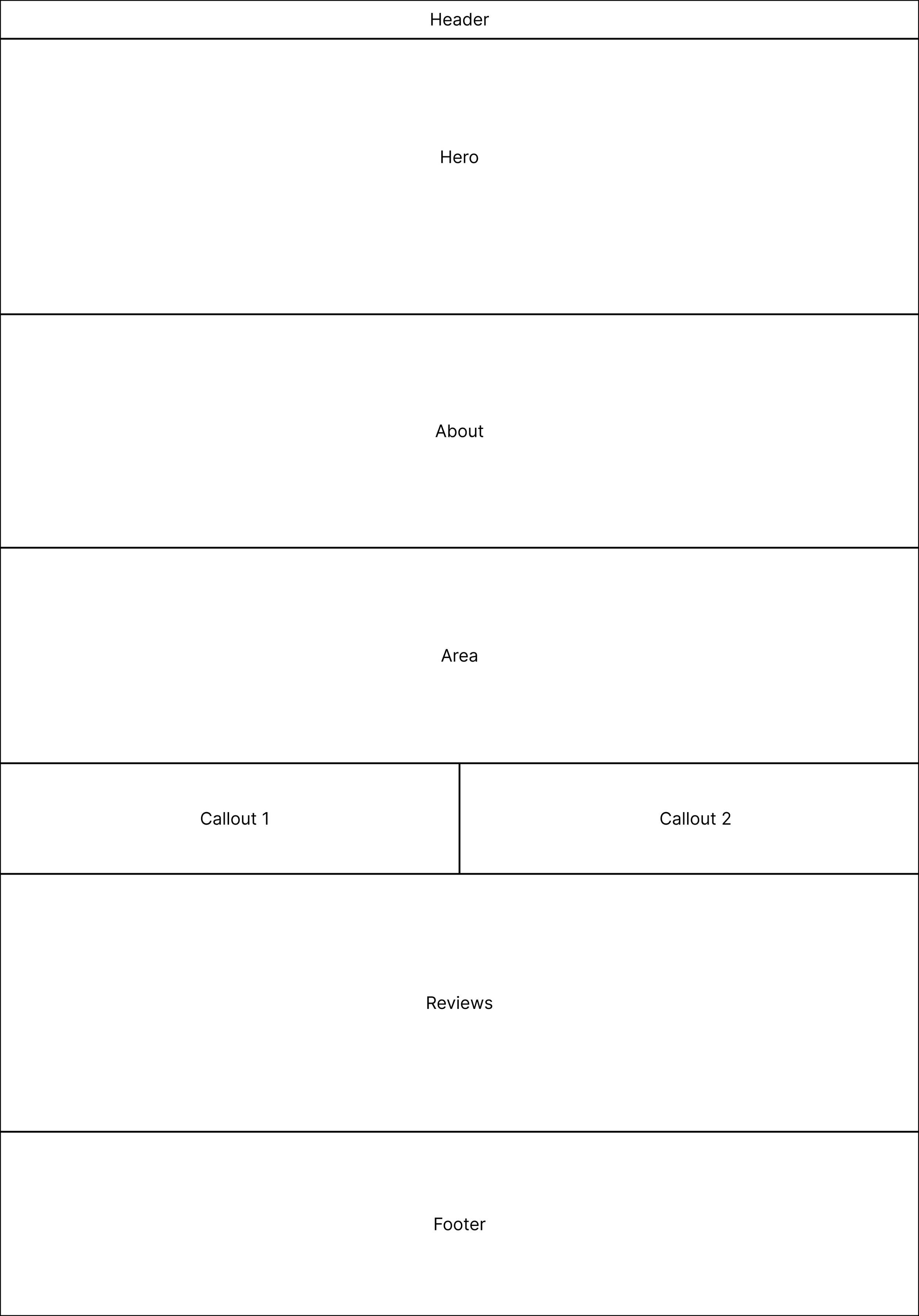
Before designing the full homepage, I mapped out the page structure using block frames — establishing the section order and spatial relationships before introducing any visual design. This ensured the content hierarchy and user flow were sound before moving into high fidelity.

Mockups
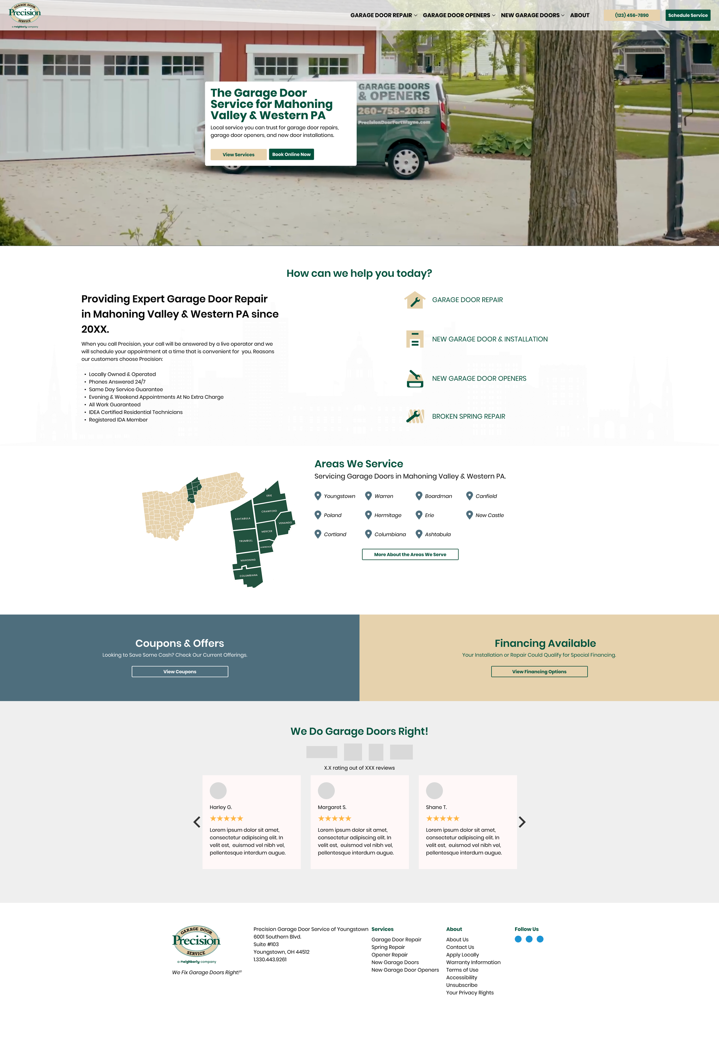
With the structure validated, I moved into high-fidelity mockups for both desktop and mobile — applying the visual system from the style guide to bring the page to life. Each section was designed to guide the user naturally from awareness to trust-building to conversion.
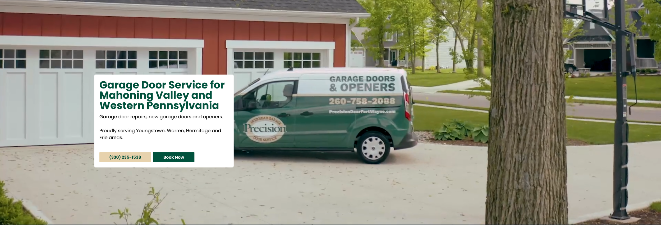
Desktop Hero Section
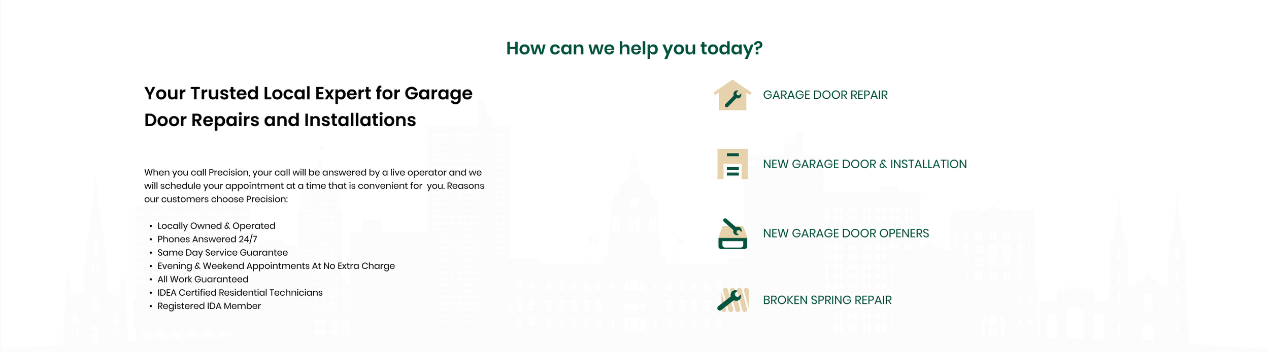
Desktop About Section
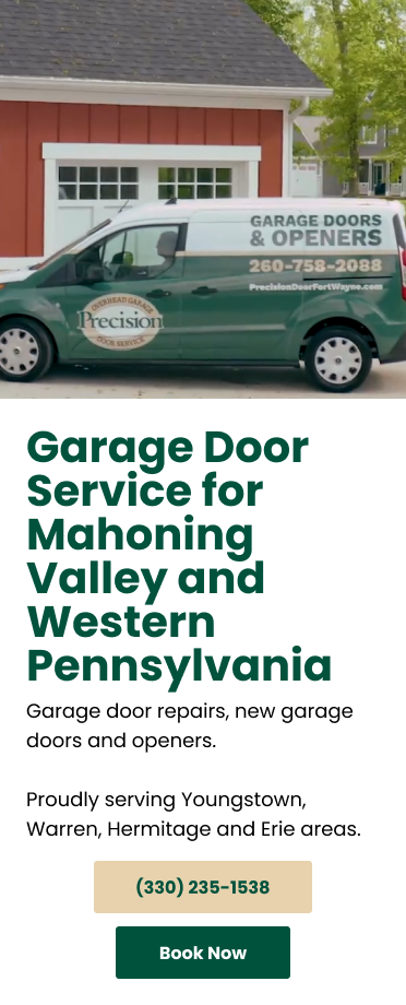
Mobile Hero Section
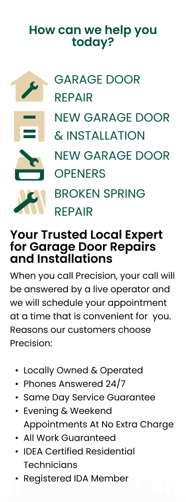
Mobile About Section
Final Design

Outcome
The design shipped. Not every section made it through development intact — parts of the wireframes were adopted rather than the full layout. That's the reality of client work. The most durable deliverable was the style guide, which gave the development team a visual system to work from even when they deviated from the layout.
Reflections
This project reinforced that a style guide isn't just a deliverable — it's insurance. When a client or developer makes changes downstream, a well-constructed visual system keeps things on-brand even when they go off-script. If I were doing this again, I'd spend more time upfront understanding the development team's constraints — knowing how they'd actually build it would have changed which layout decisions I prioritized.